Radiance
Breaking down the barriers to healthy eating.
What's the business opportunity?
According to the CDC, fewer than 1 in 7 adults eat enough fruit and an even smaller proportion eat enough vegetables.
At the same time, there is data to suggest that adults do want to eat healthier. The nutrition industry is growing at a 6.6% clip per year and is projected to reach $465.4 billion by 2025.
An app that helps alleviate the struggles with eating healthy has potential to help a lot of people and be a successful product.
Why do many struggle to eat healthy?
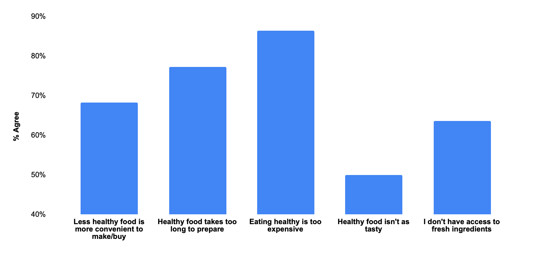
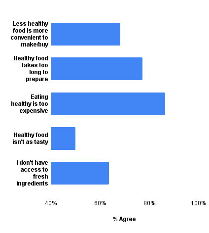
My initial hypothesis based on existing studies and research I found was that cost and perceived taste were the two largest barriers to eating healthier.
To test that hypothesis, I sent a survey to members of the Healthy Food FaceBook group, a group promoting healthy eating worldwide. I received 22 responses and followed up with 6 respondents to conduct user interviews.
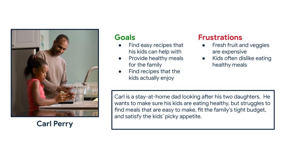
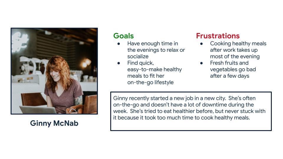
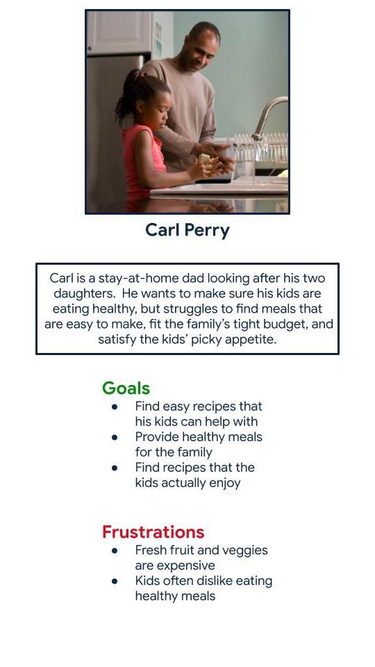
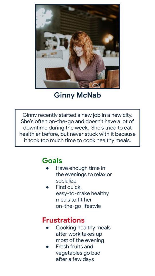
I used this data from survey respondents and interviewees to create two personas. These personas are users who would be likely use an app or website to accomplish their nutrition goals, because that was one of the constraints for this project.
Starting the design
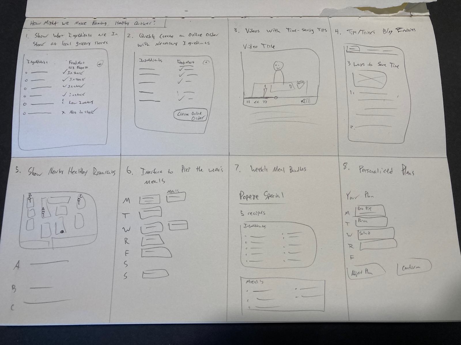
Since one of the project requirements was to design a mobile app and responsive website, most of my ideation was focused on what features could be built into those to address my persona' pain points. Below is a picture of ideas I came up with in Crazy Eights to save users time when cooking.
Wireframes and prototypes
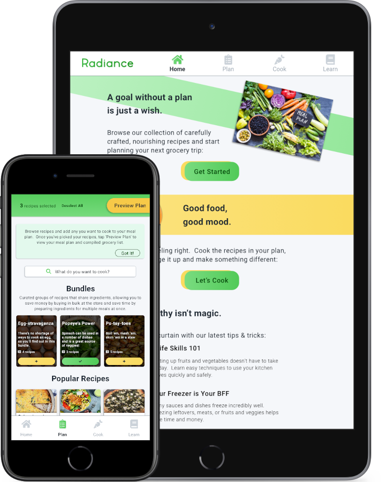
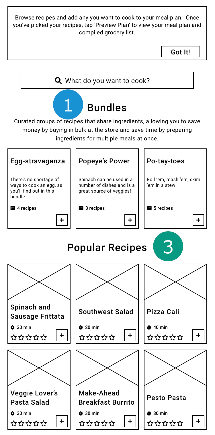
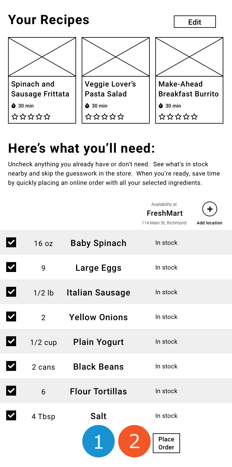
Time to start building. I decided to start with the mobile app first, since most of the users I interviewed preferred a tool on their phone to a desktop website. I had three main goals when designing the main user flow:
-
1
Increase convinience wherever possible
-
2
Be budget-friendly and transparent about cost
-
3
Keep the recipes fun, straightforward, and delicious
Testing the design
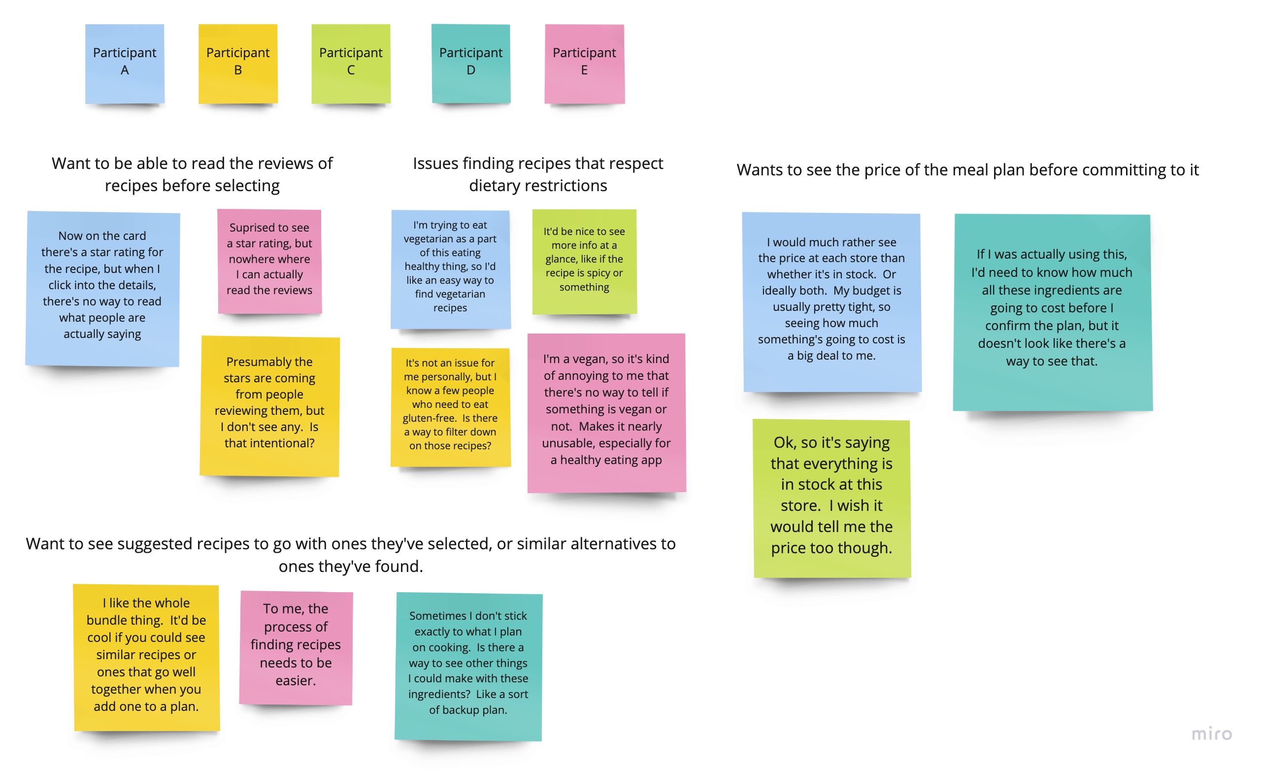
I conducted a usability study with 5 users (2 users representing the Ginny persona, and 3 representing the Carl persona) to test if they were able to complete the workflow to create a meal plan in the app, and to gather their feedback.
Study parameters
-
Study Type
Moderated Usability Study
-
Location
United States, remote
-
Participants
5 Participants
-
Length
15 - 20 minutes
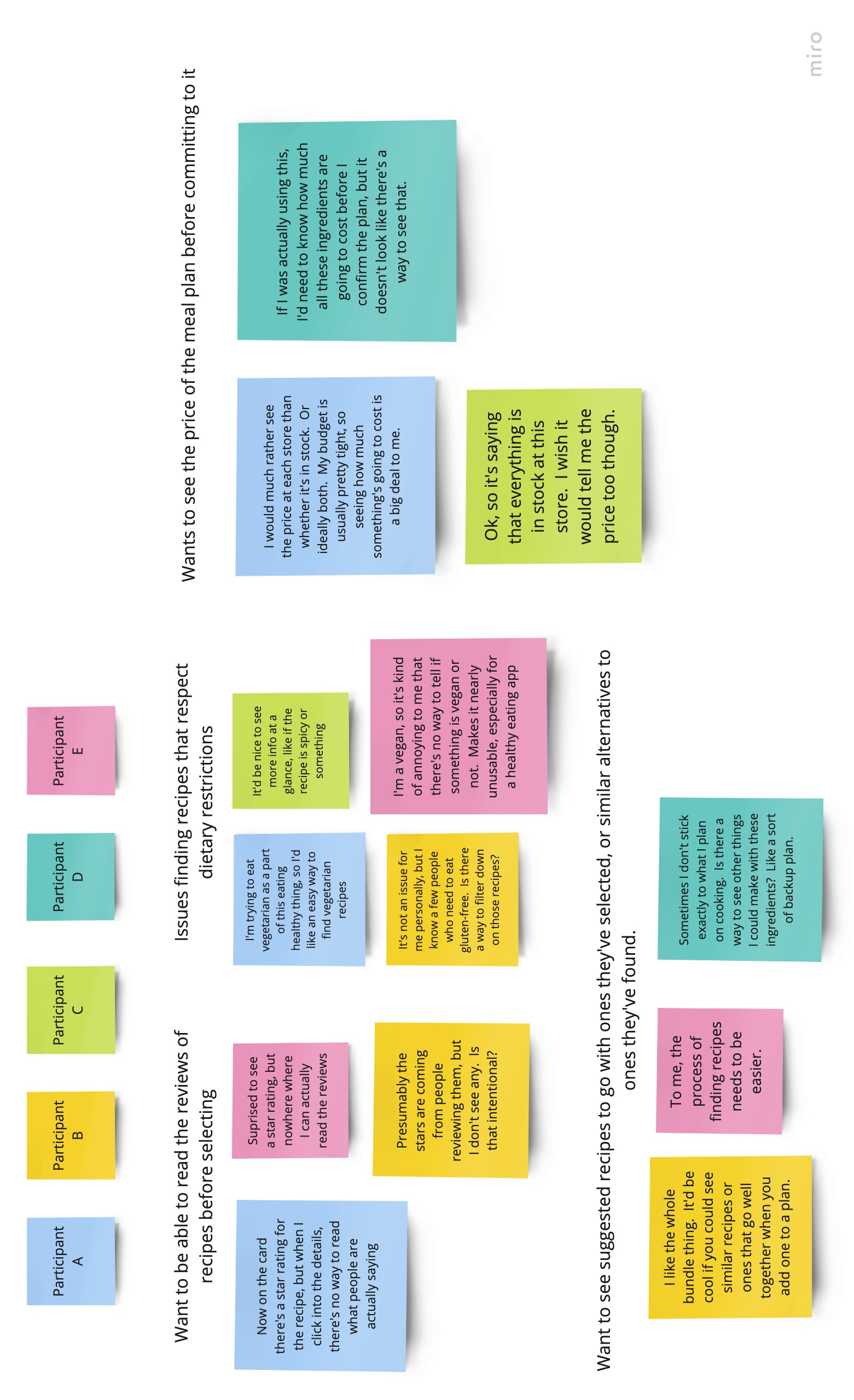
Insights
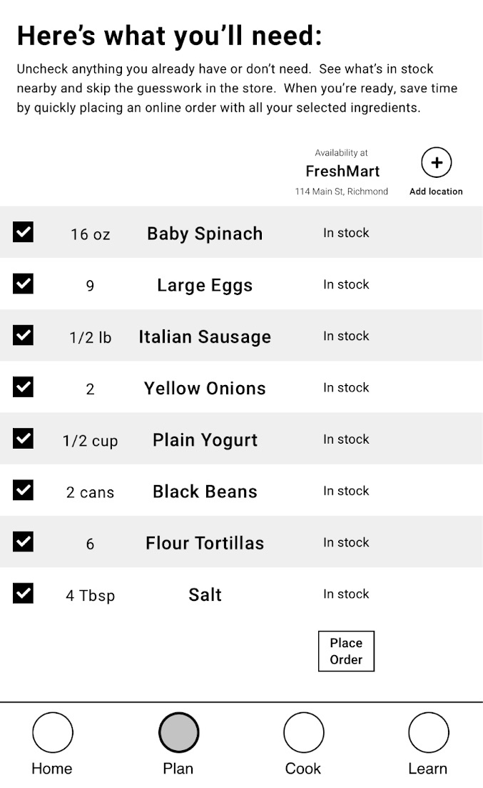
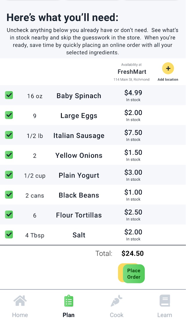
Users were unsure how much their meal plan would cost
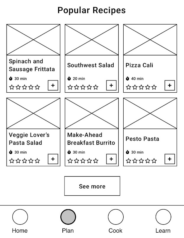
Users couldn't easily find recipes that fit their dietary restrictions
Refining the design
The first iteration of the Plan Preview page did not meet the goal to make the app budget-friendly and transparent about cost. I addressed this by adding the price of each ingredient at each store alongside its availability.
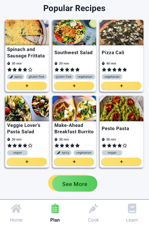
To make it easier for users with dietary restrictions to find recipes that fit their needs, I added labels to the recipe cards to more clearly call out when a recipe fits dietary restrictions.
Moving this party to the web
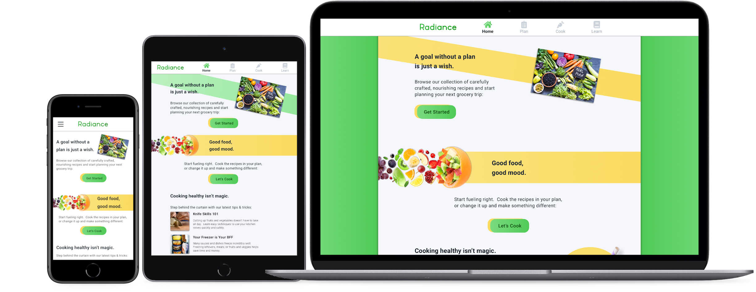
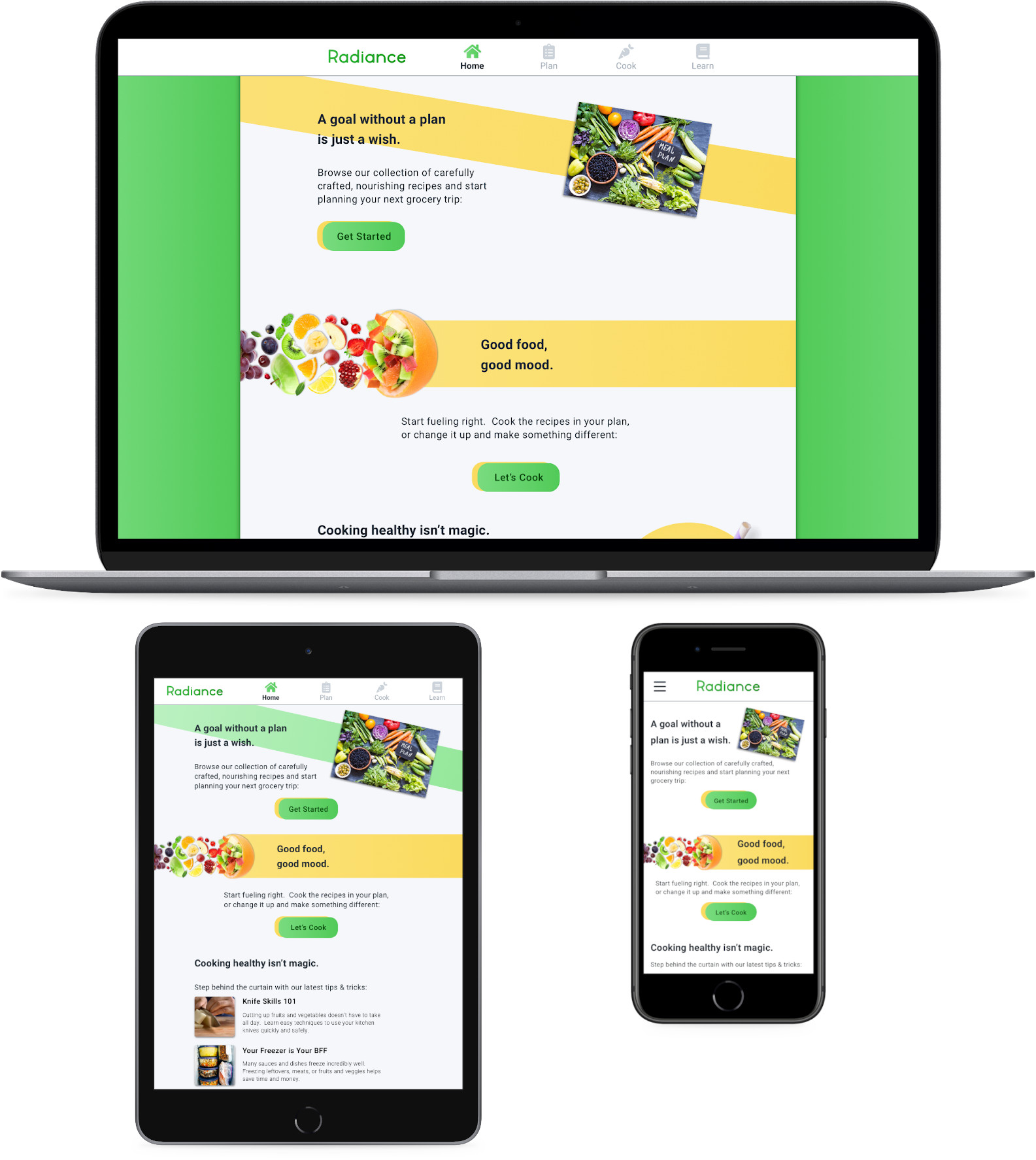
My goal for Radiance’s responsive website was to maintain consistency with the look and feel of the mobile app, while making adjustments to take advantage of more screen real estate for tablet and desktop layouts.
On mobile, the layout for the most part is the same, but the navigation bar across the bottom on the mobile app has been replaced by a traditional hamburger menu.
Takeaways
Impact
Overall, users I tested with said they liked many of the app’s features and felt like it would be a useful tool to help them eat healthier, albeit not a silver bullet.
From a business perspective, additional touchpoints on the user journey aside from an app would help this become a successful service.
What I learned
1. This was my first project using Sketch, and I learned a lot about how it works and how it differs from the other tools we’ve used in this course
2. The value of good background and user research. Eating healthy is an issue with complicated socioeconomic challenges. I had to put a lot of research and thought into what I could do with an app, and how to integrate it natuarally into user's lives.
What's next?
Thanks for taking the time to look at my work on Radiance!
Get in touch