Pathway
Guiding your way indoors and out.
Some context
Spaces like college campuses and convention centers can often feel stressful or congested, with thousands of people navigating through them. These spaces have multiple buildings, floors, and indoor and outdoor components, not to mention a ton of different events happening all at once. It's easy for someone new to feel intimidated or uncomfortable.
Why are these spaces stressful?
To try to answer this question, as well as understand the surrounding context in which users interact with these spaces, I conducted 6 user interviews.
I decided to focus on new college students and professional conference attendees, because both colleges and conferences are already tech-heavy events and these users would likely benefit the most from a mobile app.
User Pain Points
-
1
Time
Users have little time in their schedules to get from place to place.
-
2
Confidence
Some users felt intimidated being in a new place away from people and places they know.
-
3
Accessibility
Complex and crowded spaces are particularly difficult to navigate for users with mobility disabilities.
-
4
Lost Indoors
Users generally felt the most anxious or uncomfortable indoors, where their phone's GPS isn't as helpful.
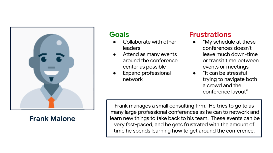
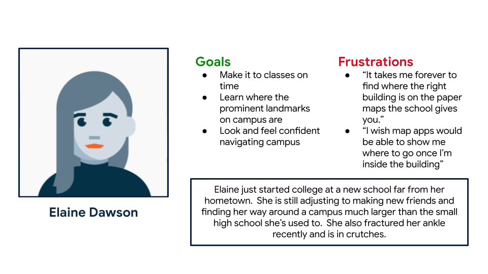
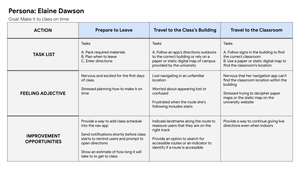
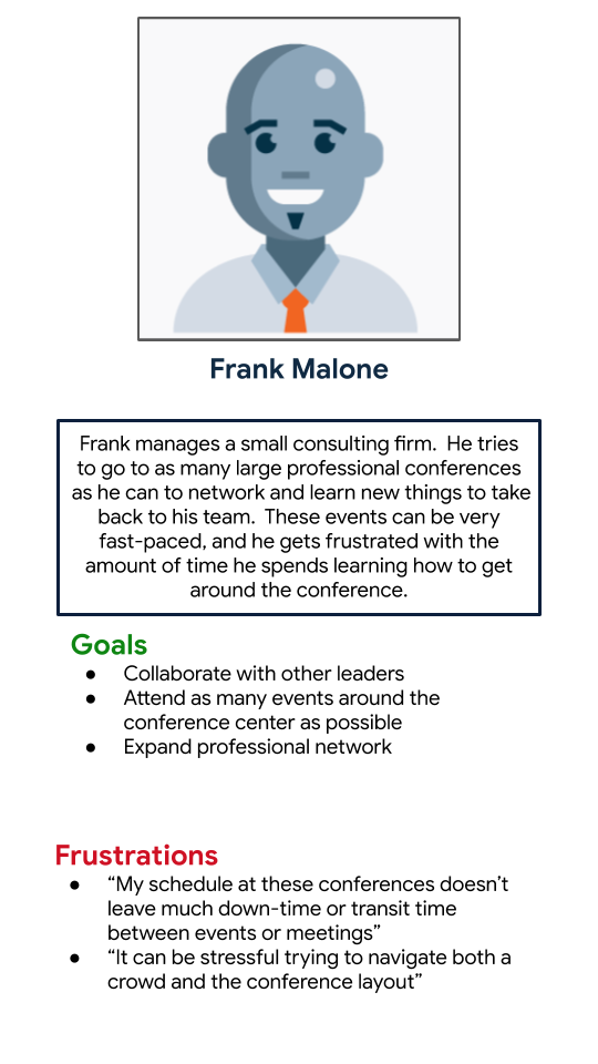
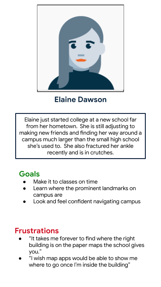
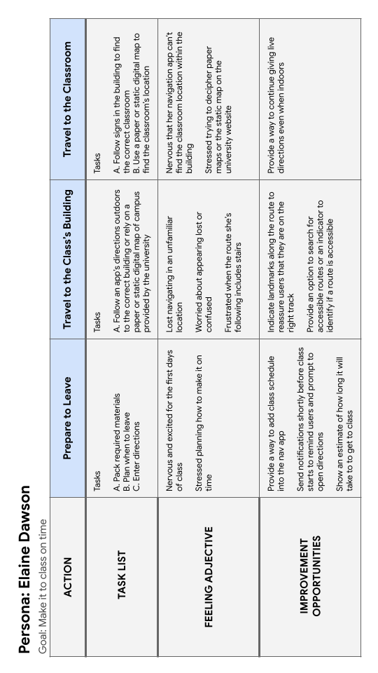
I used what I learned in my interviews to map the "as is" user journey and create two personas. The Frank persona will help me keep the needs of professionals and convention attendees in mind, while the Elaine persona will help make sure the app works for those on college campuses.
How might a new mobile app help?
Based on my research, I knew my design solution needed to help save time, build familiarity, and get people of all abilities where they need to go. After some How Might We and Crazy Eights exercises, I decided to design a navigation app that could work both indoors and outdoors.
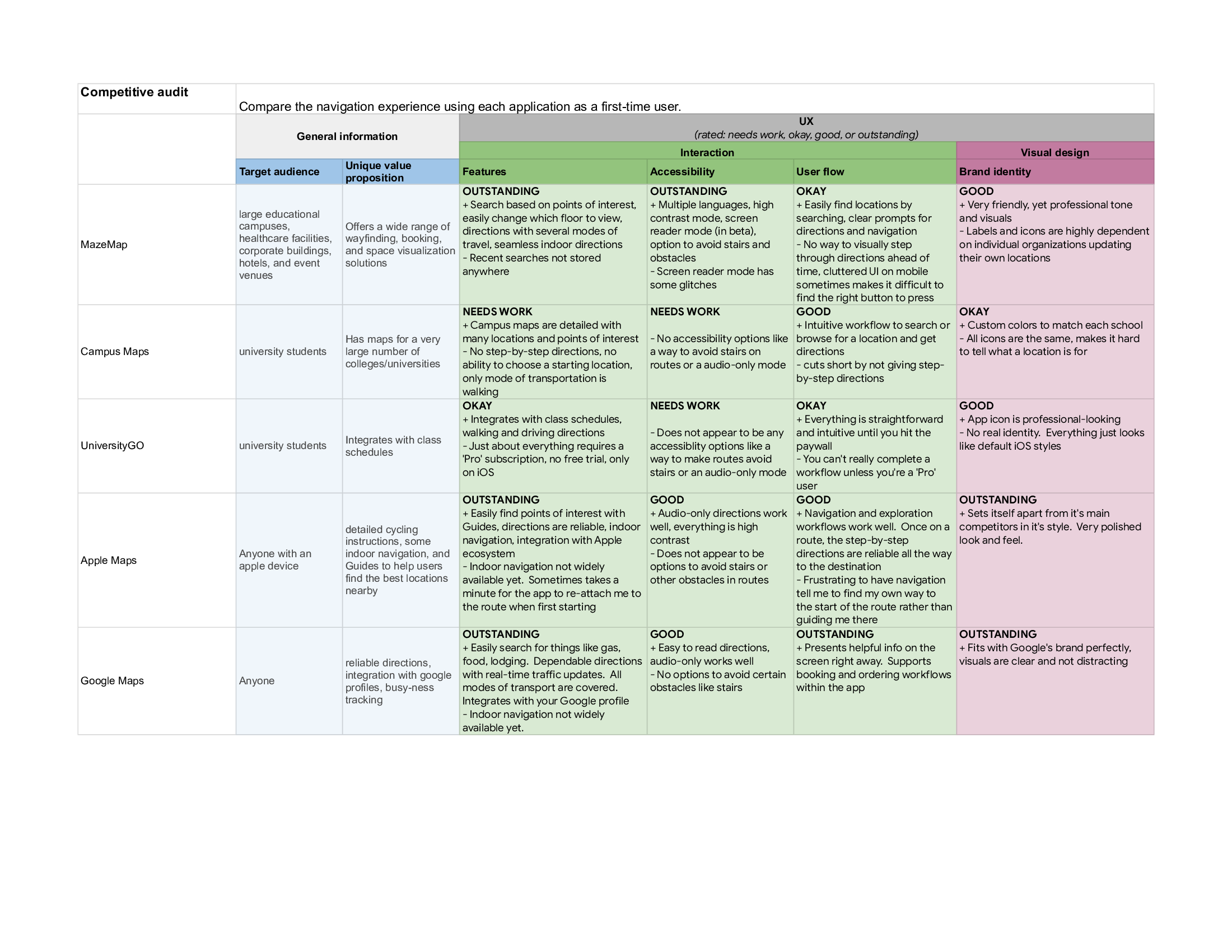
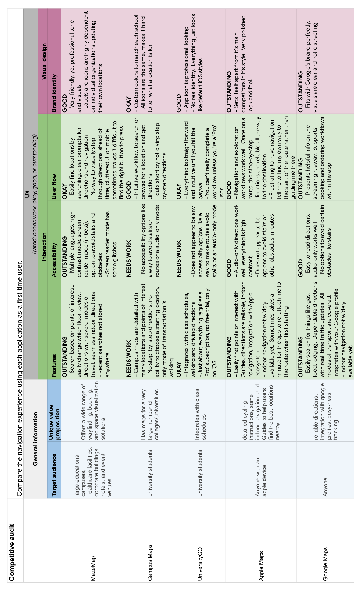
I conducted a competitive audit of other navigation apps to identify what works well, and where my app has a chance to stand out from the crowd:
Wireframes and prototypes
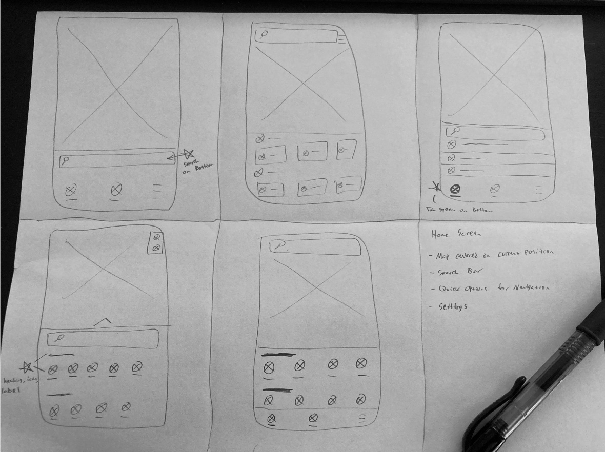
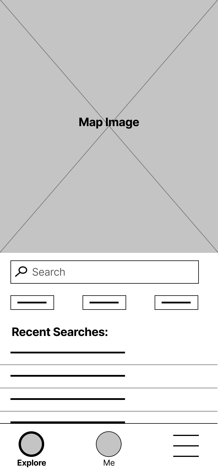
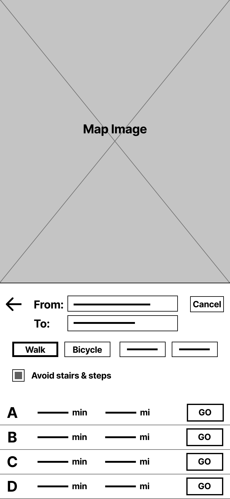
Time to start putting pen to paper. I iterated on the high level layout of the app’s pages on paper before I took time towards digitizing them in Figma. I had 3 main goals based on what I knew about my users
-
1
Keep the interaction as simple as possible
-
2
Boost convinience wherever possible
-
3
Be consious of people with disabilities
Testing the design
I conducted two rounds of usability studies. One with a low-fidelity prototype and another with a later, high-fidelity iteration. Each usability study was with 4 users - 2 users representing the Frank persona, and 2 representing the Elaine persona.
Study parameters
-
Study Type
Moderated Usability Study
-
Location
United States, remote
-
Participants
4 Participants
-
Length
15 - 20 minutes
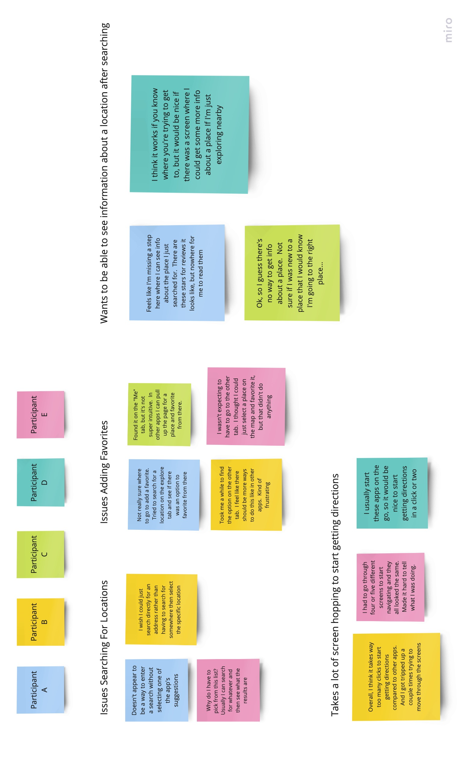
Insights
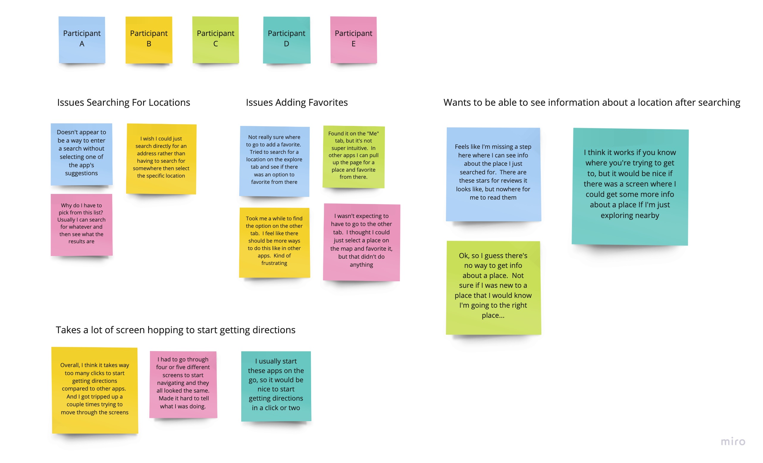
Users needed to see more information about a location
The user flow took too many steps to complete
Favoriting a location and getting to the Route Select screen were unintuitive
Refining the design
-
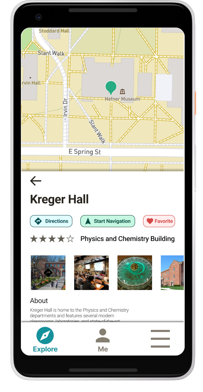
Early designs didn’t have a screen for seeing information about a location, but based on feedback in the usability study, I added that screen to the user flow.
-
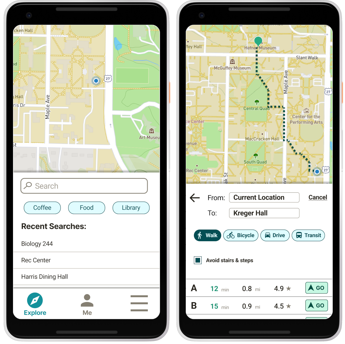
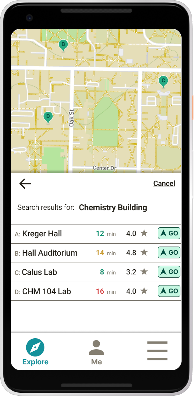
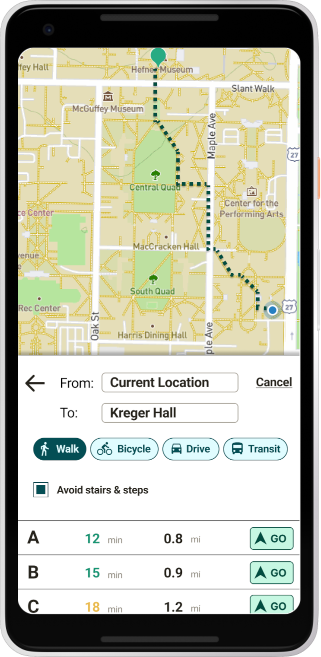
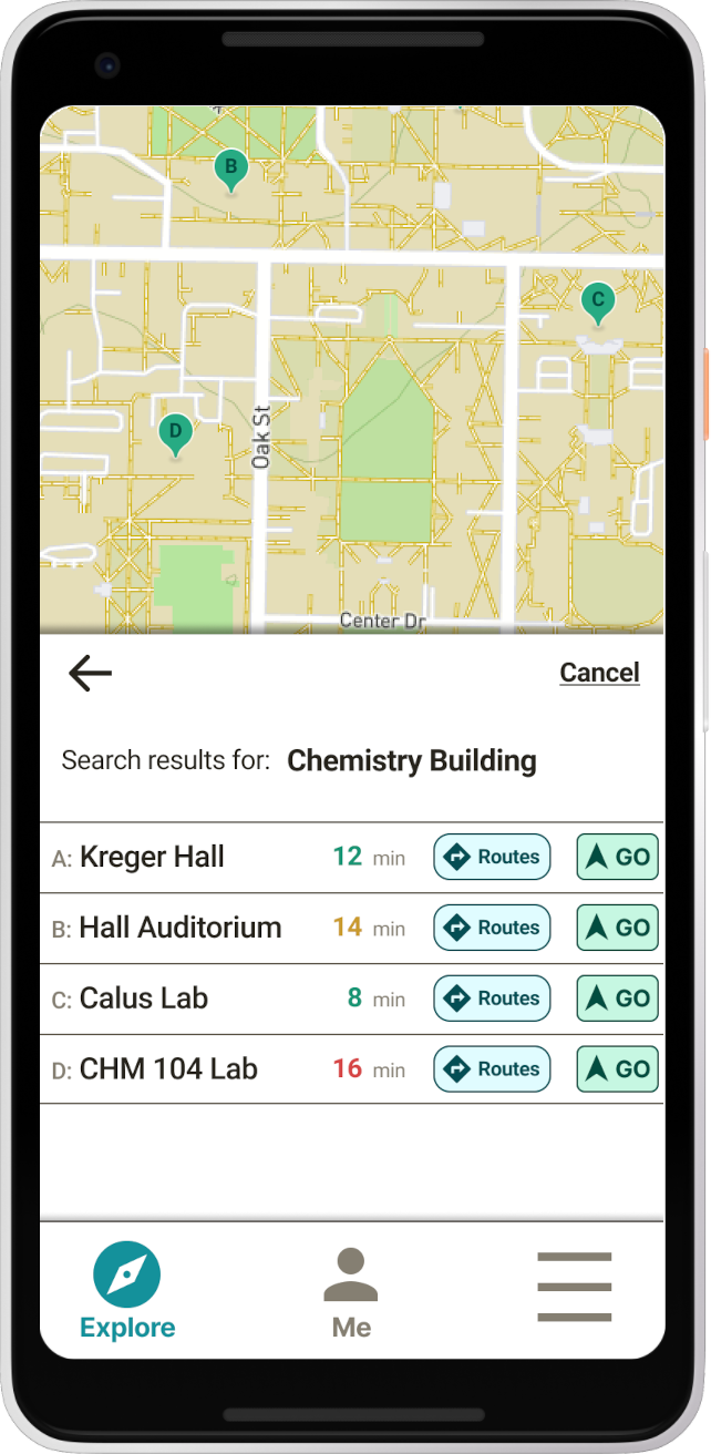
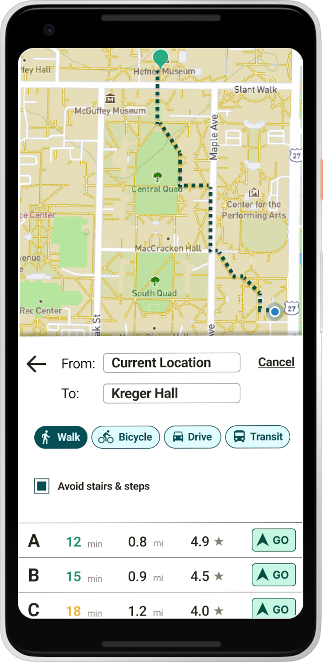
My second usability study revealed problems with the ‘Search Results’ and ‘Route Selection’ parts of the user flow. To address these, I made the following changes:
Removed location ratings on the search results screen
Added route ratings on the route selection screen
Added a button to view routes to the search results screen
Before
After
Takeaways
Impact
Users I tested with said they would be confident using the app and that it would definitely help them feel more comfortable in a new place.
What I learned
This was my first project as a UX-er in training! I learned so much about the user-centered design process, connecting with users, how to use digital tools like Figma, and much, much more.
What's next?
Thanks for taking the time to look at my work on Pathway!
Get in touch