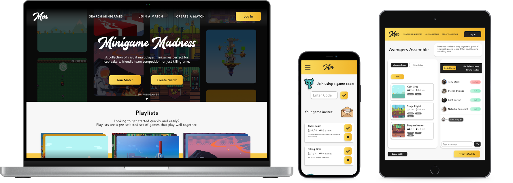
Minigame Madness
Quick, casual minigames perfect for meeting icebreakers or friendly team competition.
What's the business need?
Unengaging meeting drain employees off their energy, brainpower, and stamina, costing billions across the US economy each year.
Meanwhile, since the pandemic started, the number of meetings at work has jumped 10%, or about 3 extra meetings per week, per employee.
If meetings are here to stay, there is a need to help keep everyone engaged and productive during them.
What makes a meeting effective?
I asked 4 of my coworkers at Epic, who collectively schedule and attend dozens of meetings every week, about their experience leading and participating in meetings. I was interested in hearing what they thought worked, what their favorite meetings are, and why.
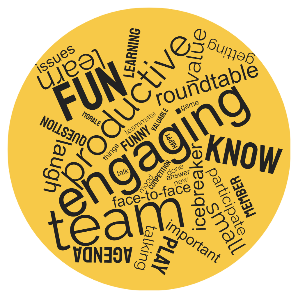
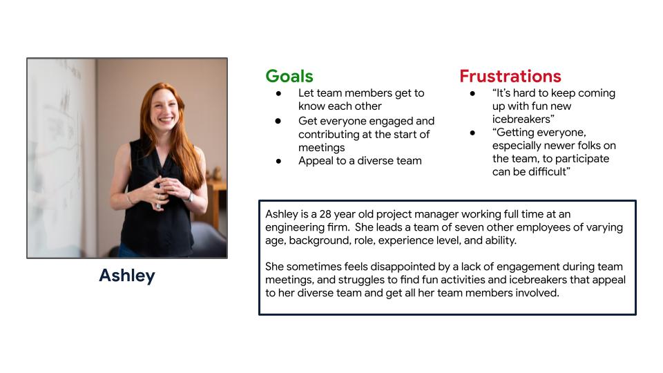
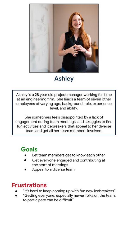
Overall, the users I talked to found that meetings that are engaging and help build stronger relationships among the team are the most successful, and that having a bit of fun is the best way to do that. That feedback became the basis for a persona, which I’d use throughout the design process.
All fun and games: starting the design
One of the project requirements was to design a responsive website, which helped narrow the scope of what I was brainstorming.
I landed on the idea to make a collection of short, team-focused, minigames that could be played online. This would hit on my goals to get everyone participating, bring people closer together, and have some fun.
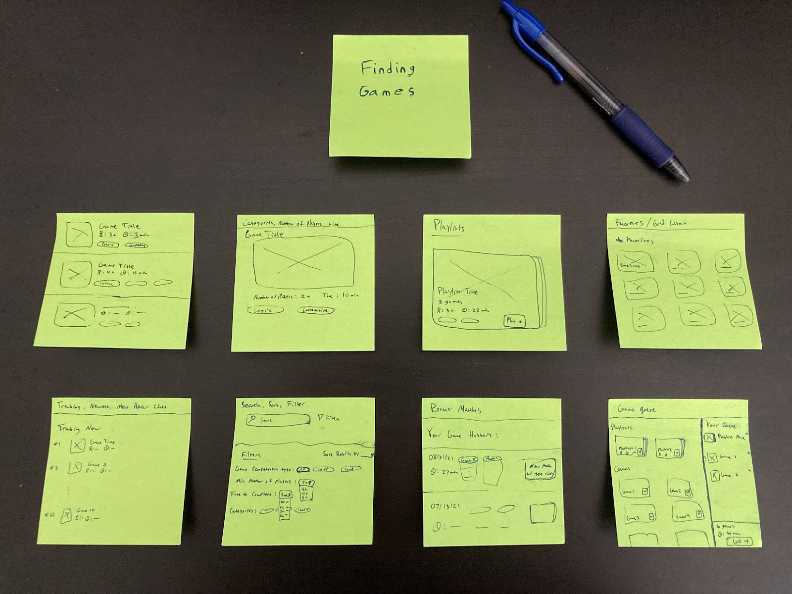
Below is some of the ideas I had for how to find games to play on the site:
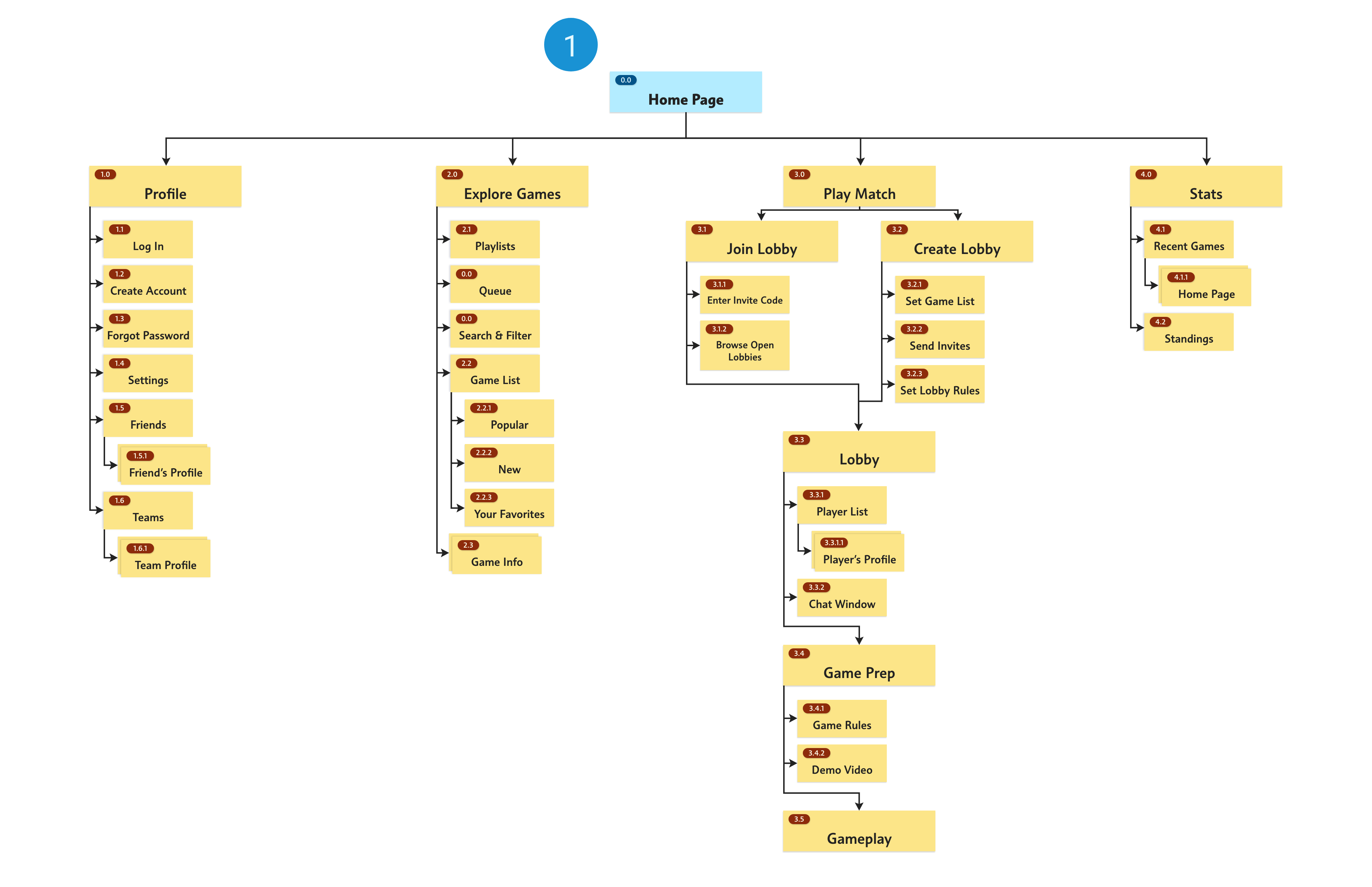
Sitemap & low-fi designs
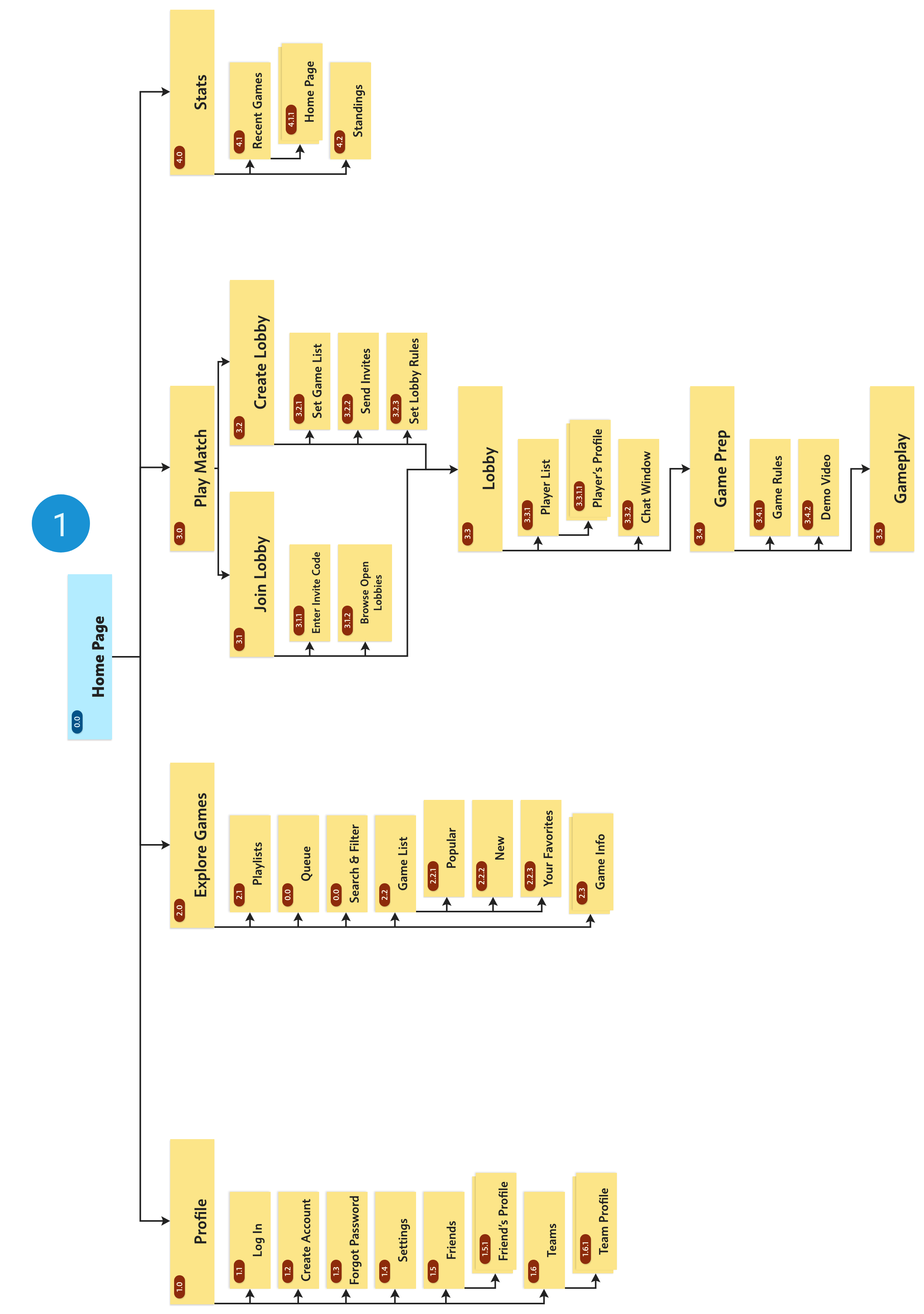
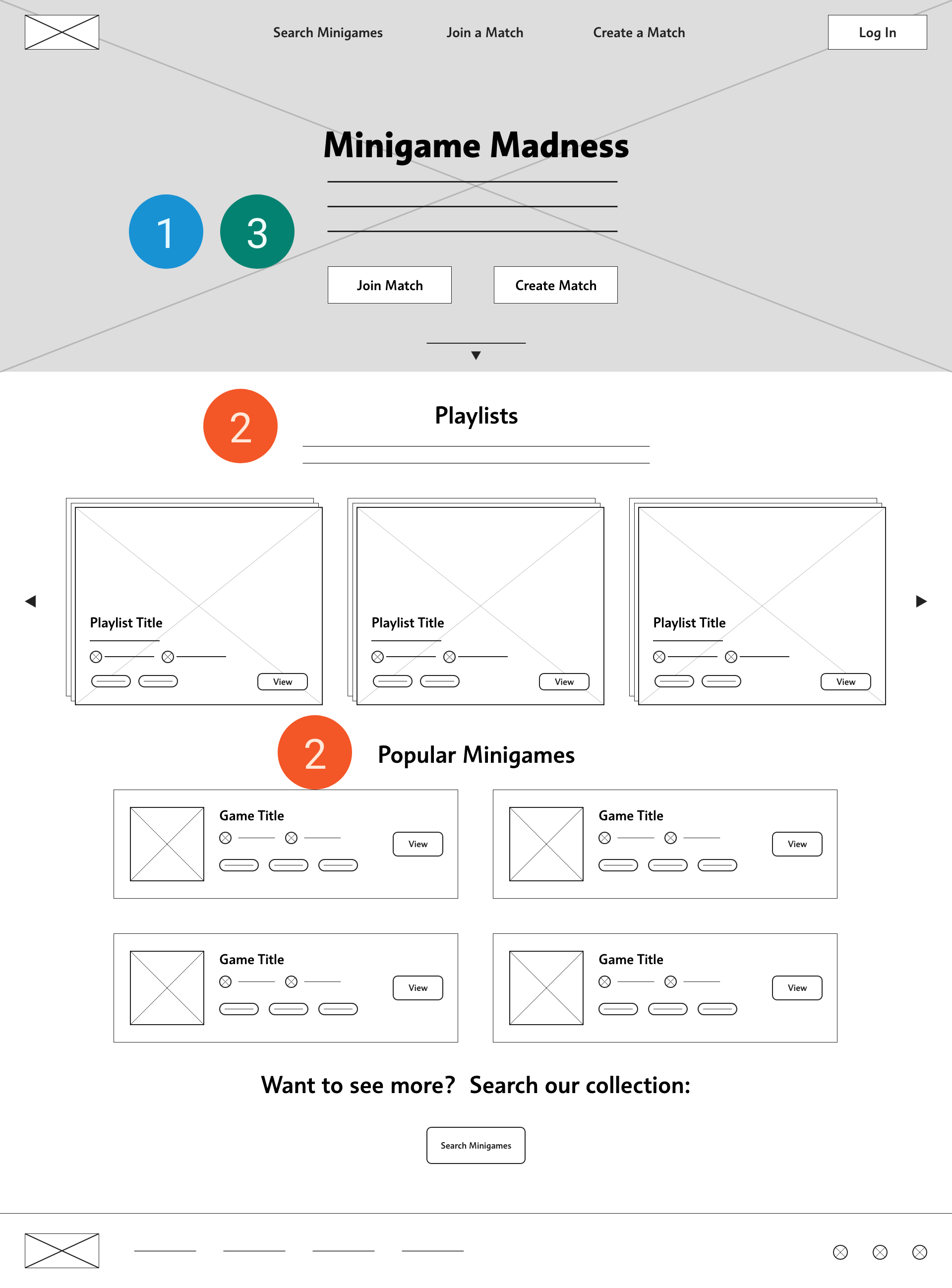
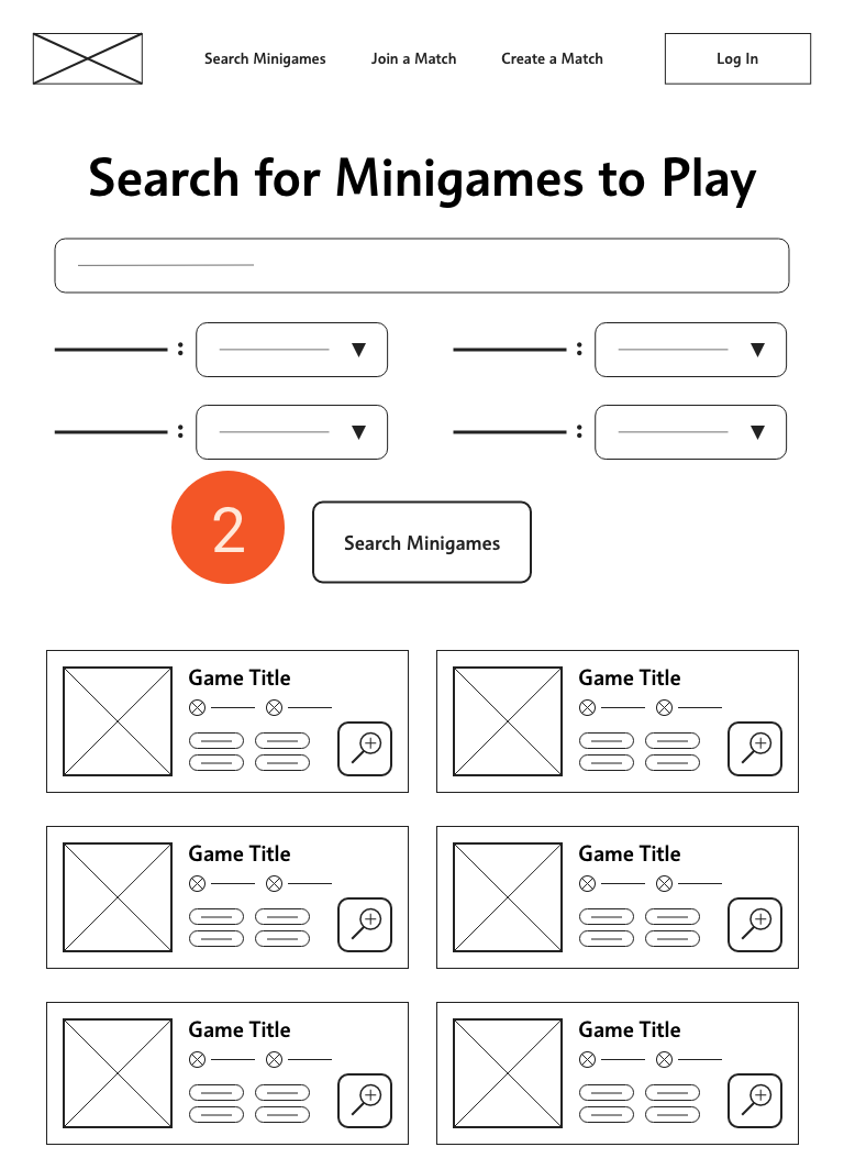
Now that I had an idea of what I wanted my website to be, it was time to start planning the information architecture of the site and building the screens. Looking at my persona’s goals and behaviors, I had a couple things to keep in mind when designing the IA and wireframes for the site:
-
1
Site should be quick and easy to navigate. Icebreakers often only take up a few minutes.
-
2
Users should spend the majority of time on the site playing, not picking games
-
3
Avoid unnecessary barriers to playing with who you want
Putting it to the test
I conducted a usability study with some more of my coworkers at Epic, who represent my persona, to test the usability of the site and get feedback on the layout and structure of the site so far.
Study parameters
-
Study Type
Moderated Usability Study
-
Location
Madison, WI, USA
-
Participants
4 Participants
-
Length
10 minutes
Insights
-
Going from browsing games to creating a match and playing those games is awkward
-
Users weren’t sure if they would use the site without seeing more details about the minigames
Refining the design
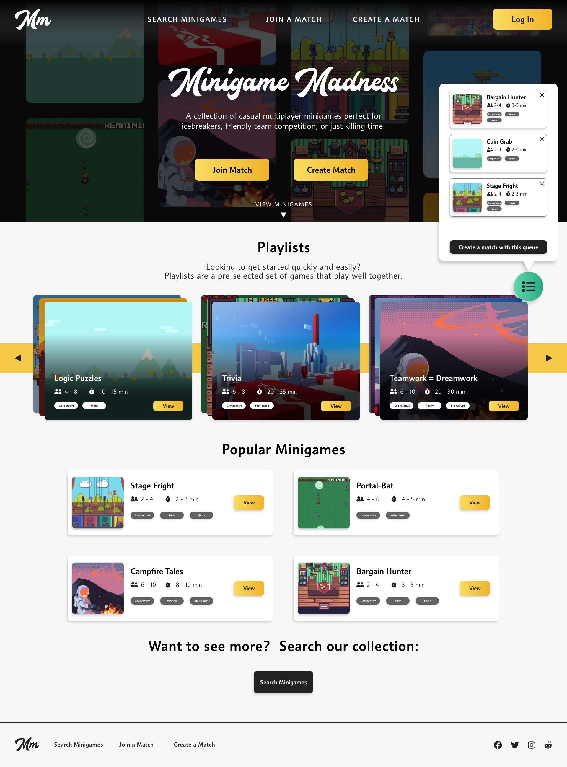
Users were getting stuck when trying to go from looking at the minigames to playing them.
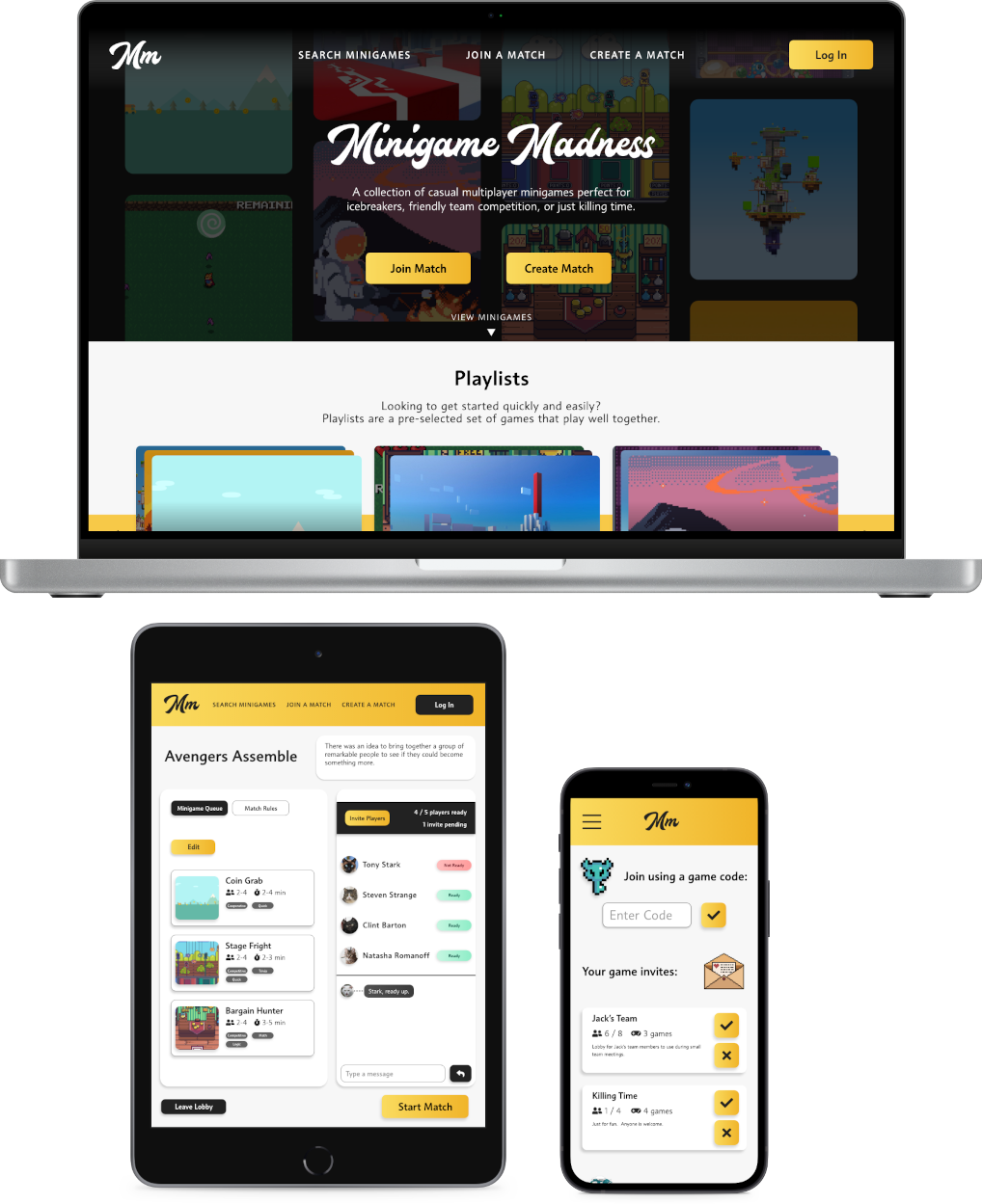
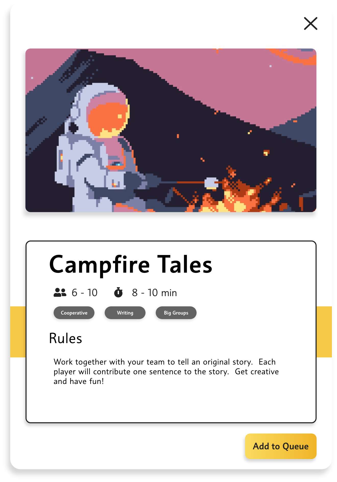
To make this more intuitive, I added a way to set up a game queue and quickly create a match from the queue
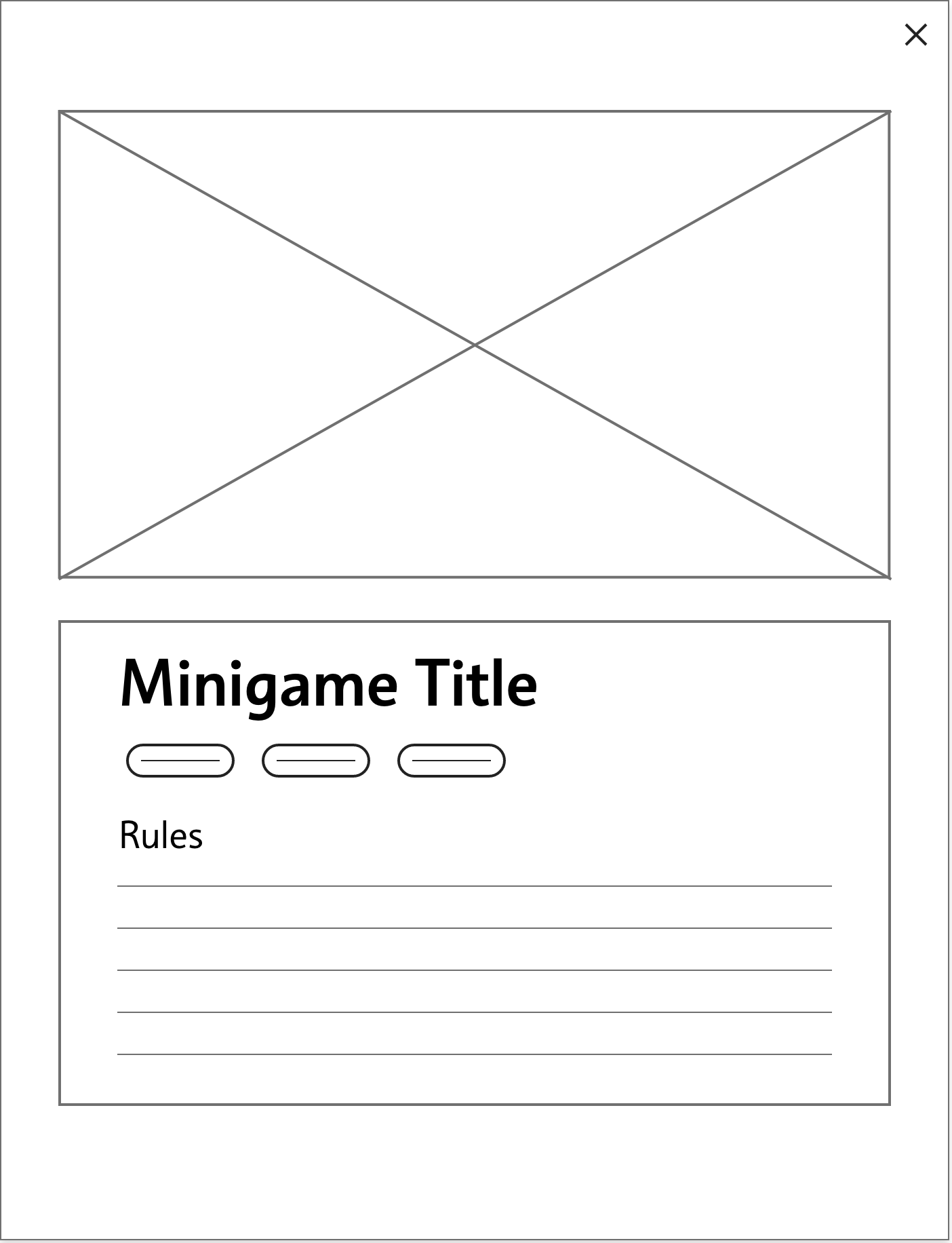
Most users couldn’t say that they’d use the site themselves without seeing the minigames on the site.
Addressing this feedback was the most fun part of the project. I got to think of fun minigames to add to the site and how they should be played.
Takeaways
Impact
Most of the users I spoke to loved the idea, although some users raised concerns that it may be too distracting for certain meetings.
Some additional research should be done to investigate ways to maintain the spirit of the site while appealing to more professional settings.
What I learned
Carefully planning the information architecture of the site helped me keep the layout organized and easy to navigate.
I put a lot of effort towards the visual design of the site in this project. I learned about the ins and outs of Adobe XD, as well as how to apply gestalt principles in my page layouts.
What's next?
Thanks for taking the time to look at my work on Minigame Madness!
Get in touch